

Jan 2, 2026
A Guide to Tile Layout Styles: Heritage, Character, and How They Shape a Space
Tile layout is one of the most overlooked decisions in a renovation.
Most people focus on tile colour or size, but it’s the layout that defines how a space feels, calm or busy, generous or tight, timeless or trend-driven.
Every tile layout has a history. Many come from centuries-old building traditions, others from modernist architecture. Used well, they bring balance and intention to a space. Used poorly, they can overwhelm it.
This guide breaks down the most common tile layout styles, where they come from, and what they actually do for a room, especially in Sydney homes.
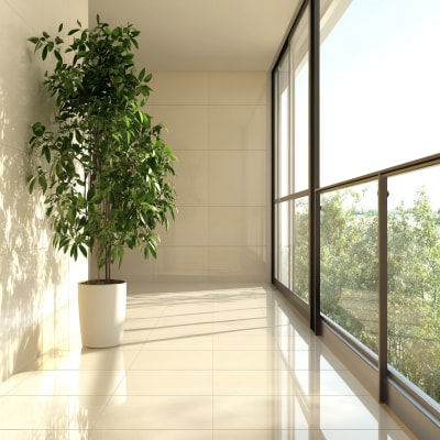
1. Stack Bond (Straight Lay)
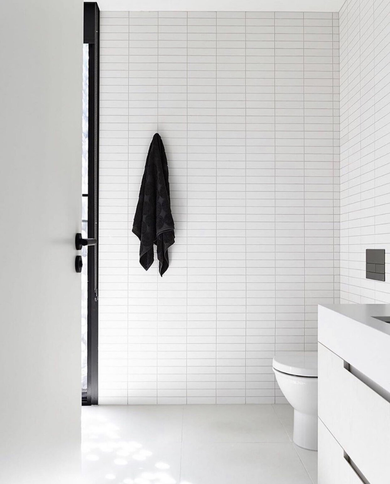
Heritage & origin
Stack bond is a modern layout, popularised by mid-century and contemporary architecture. It rejects traditional masonry logic in favour of clean alignment and repetition.
The look
Calm
Minimal
Architectural
Tiles are laid directly on top of each other, with vertical and horizontal grout lines perfectly aligned.
What it does for a space
Emphasises order and structure
Makes spaces feel intentional and refined
Highlights tile size and surface quality
Best colours & finishes
Soft neutrals (warm whites, stone tones, greys)
Large-format porcelain
Natural stone with subtle movement
Builder’s note
Stack bond is unforgiving. Any substrate imperfection shows immediately. It works best when the structure and preparation are spot-on.
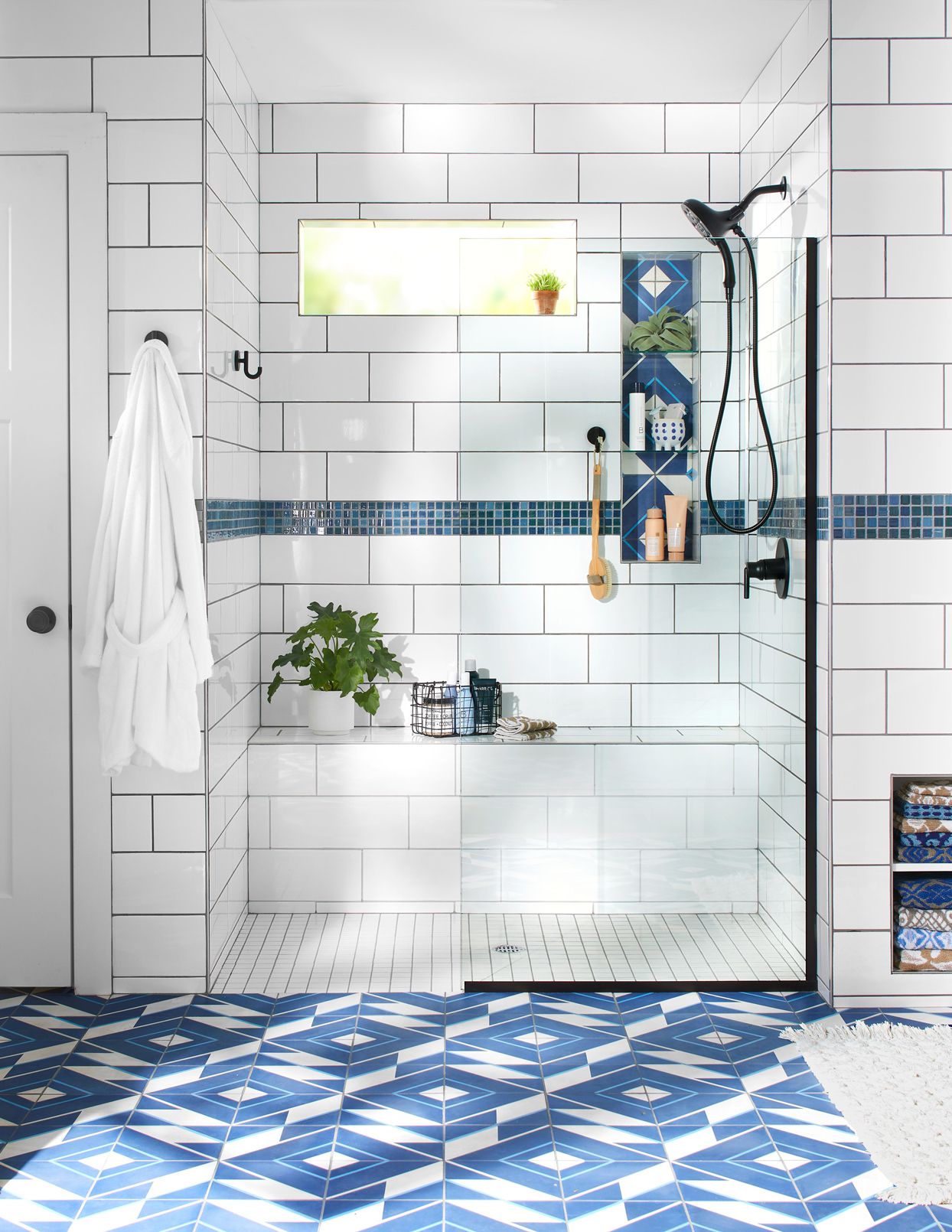
2. Brick Bond (Subway / Offset)

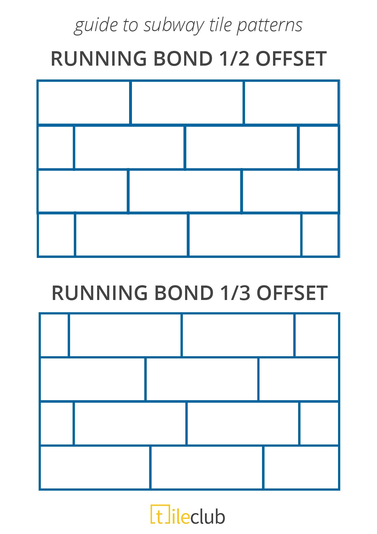

Heritage & origin
Rooted in traditional brickwork and early 20th-century interiors. This layout exists because it hides inconsistencies, a practical solution that became a classic.
The look
Familiar
Comfortable
Timeless
Tiles are offset (usually by 50% or ⅓), creating movement across the wall.
What it does for a space
Softens irregularities
Adds visual rhythm
Feels approachable and lived-in
Best colours & finishes
Whites and off-whites
Gloss finishes
Handmade or slightly irregular tiles
Builder’s note
A full 50% offset isn’t suitable for all large-format tiles due to warping. Often, a ⅓ offset performs better and looks cleaner.
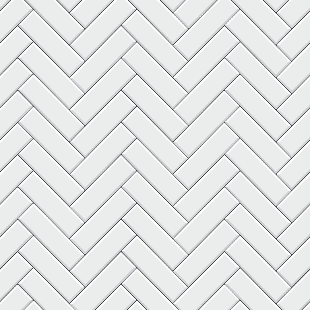
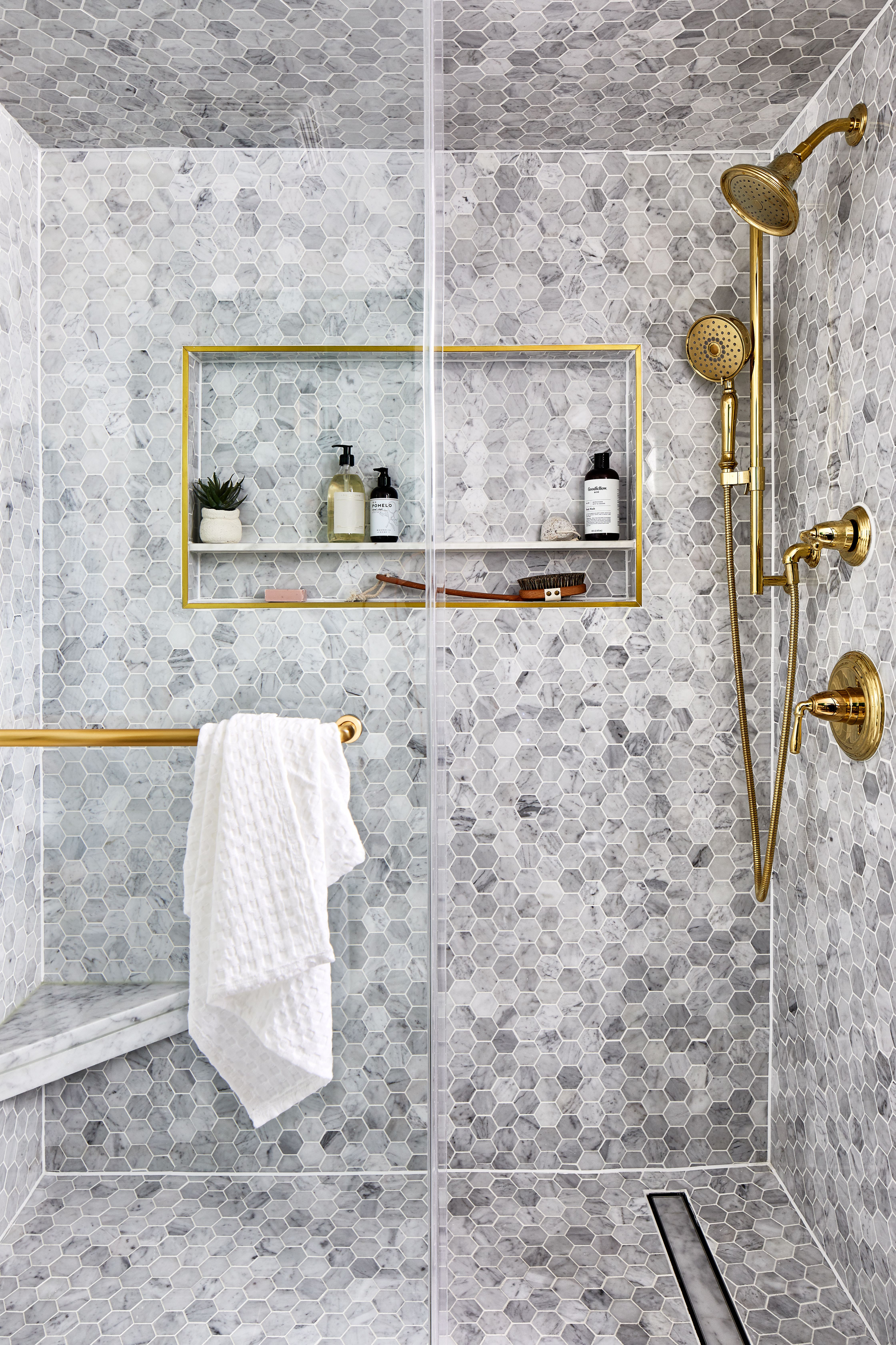
3. Herringbone
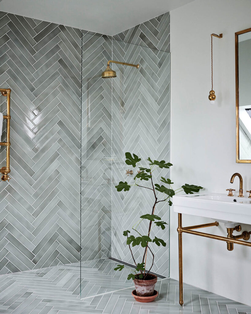
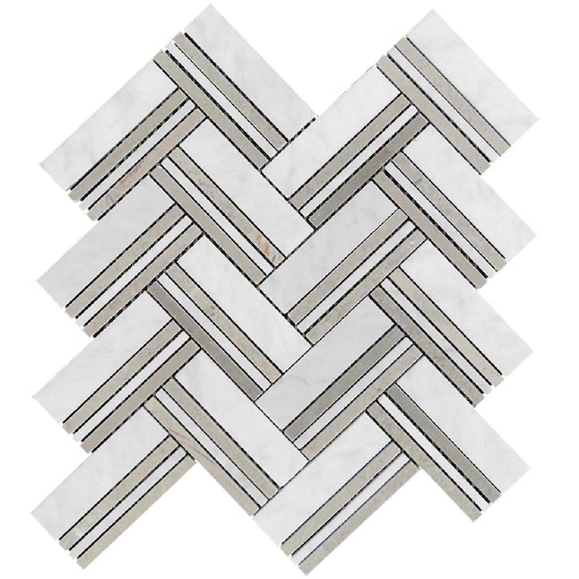
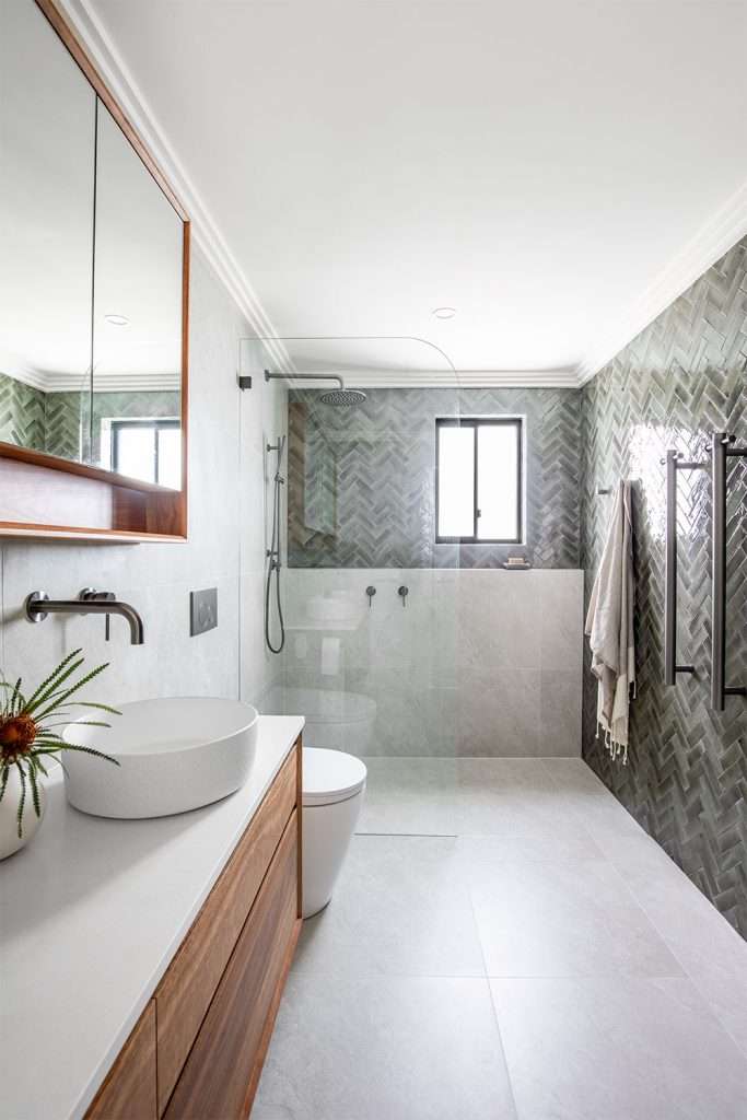
Heritage & origin
Dating back to Roman roads and later European palaces, herringbone was originally a structural solution, strength through interlocking.
The look
Elegant
Expressive
Detailed
What it does for a space
Adds movement and texture
Draws the eye
Elevates smaller areas
Best colours & finishes
Soft neutrals
Muted stone tones
Matte finishes
Builder’s note
Herringbone requires precision. Small inconsistencies multiply quickly, which is why it’s best used selectively, feature walls, floors, or niches.
4. Chevron
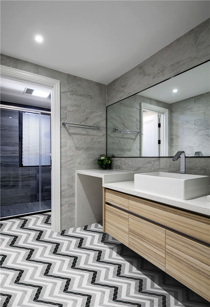
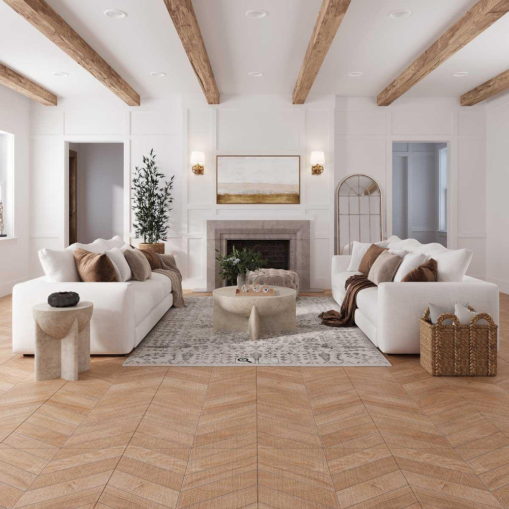
Heritage & origin
Chevron evolved from classical European flooring but became popular in modern luxury interiors due to its symmetry.
The look
Sharp
Directional
Statement-driven
What it does for a space
Creates strong visual direction
Adds drama and formality
Makes spaces feel designed rather than decorated
Best colours & finishes
Tonal palettes
Stone-look porcelain
Consistent colour ranges
Builder’s note
Chevron demands accurate cutting and alignment. It’s less forgiving than herringbone and works best in controlled, well-proportioned spaces.
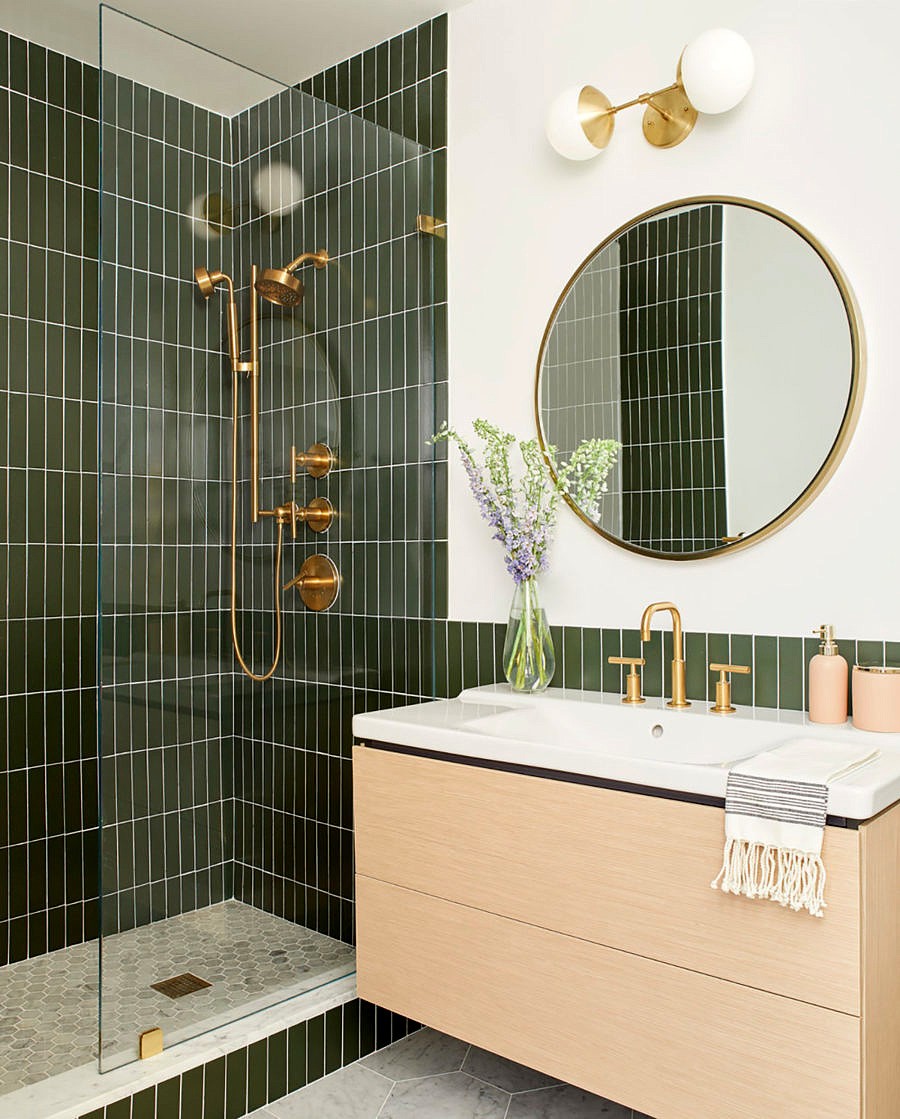
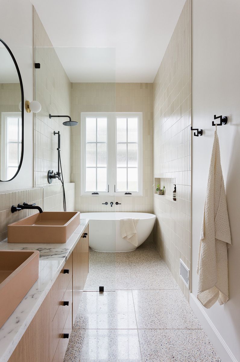
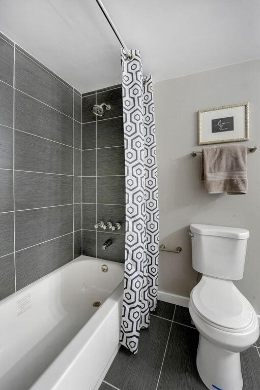
5. Vertical Stack (Vertical Subway)
Heritage & origin
A contemporary reinterpretation of classic subway tiles, influenced by modern European bathrooms.
The look
Fresh
Subtle
Modern
What it does for a space
Emphasises height
Makes ceilings feel taller
Lightens compact bathrooms
Best colours & finishes
Whites and light neutrals
Gloss or satin finishes
Builder’s note
Vertical layouts amplify alignment issues. Grout lines must be consistent or the effect is lost.
6. Grid / Square Lay
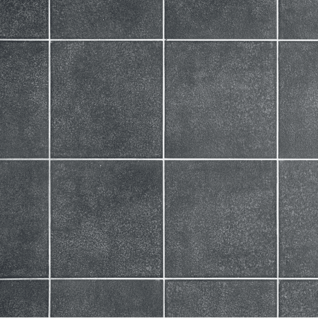
Heritage & origin
Inspired by modernist architecture and Japanese interiors, where order and proportion are central.
The look
Balanced
Rational
Calm
What it does for a space
Creates visual stability
Suits minimalist interiors
Lets materials speak
Best colours & finishes
Stone tones
Concrete-look porcelain
Muted, earthy palettes
Builder’s note
Grid layouts reward precision. When done well, they feel effortless, when rushed, they feel rigid.
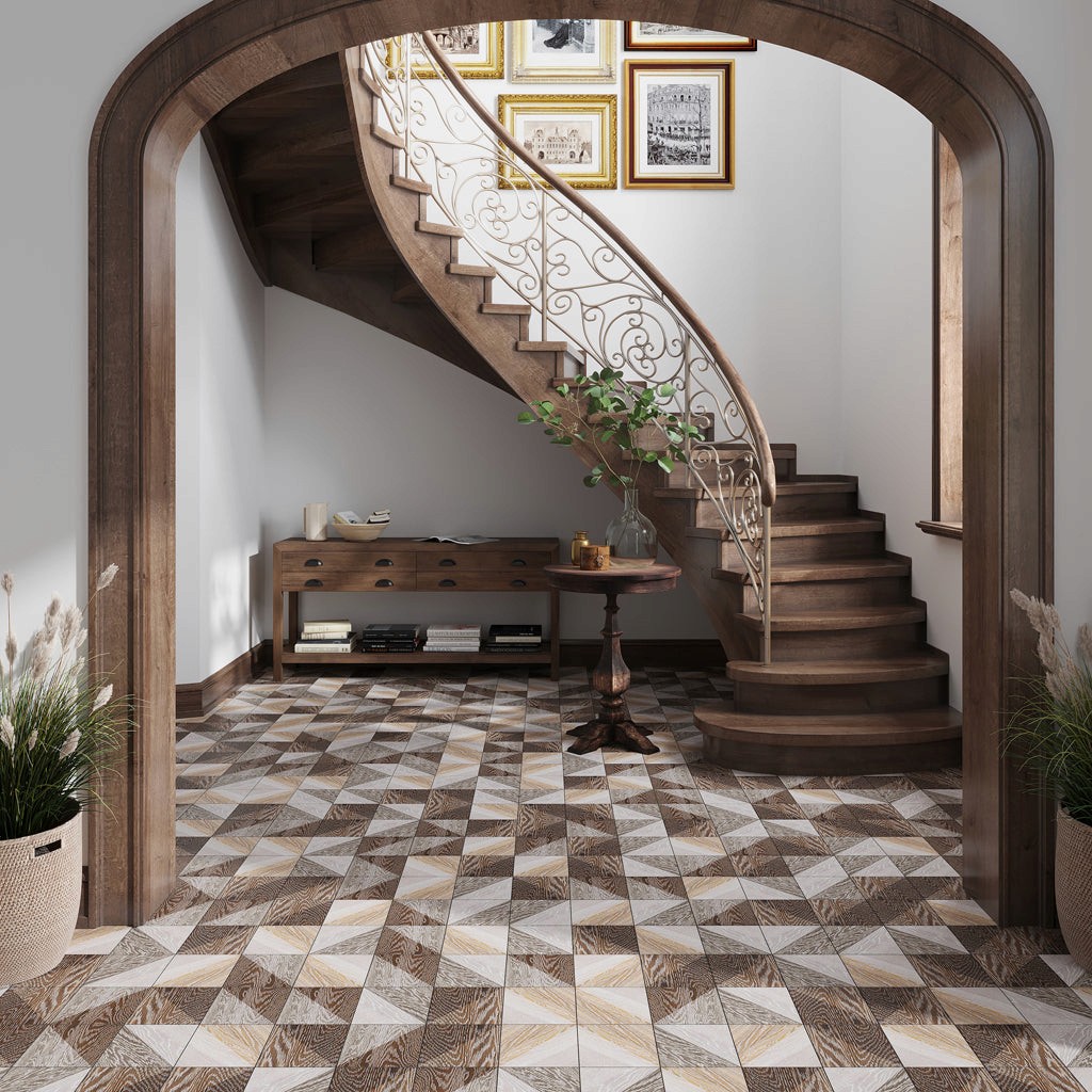
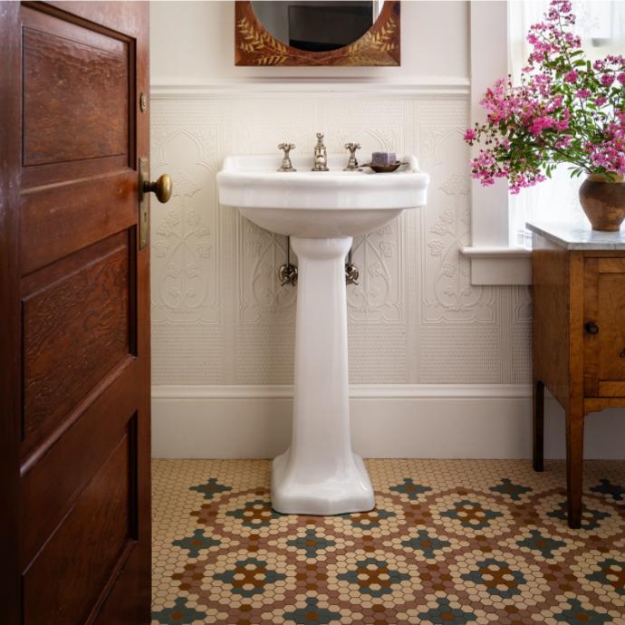
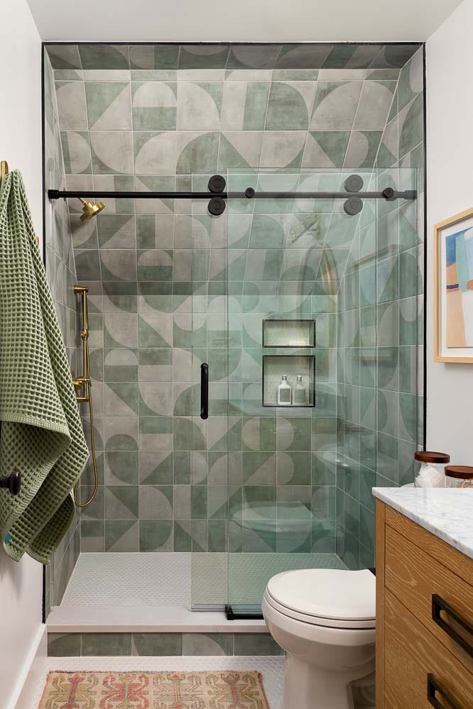
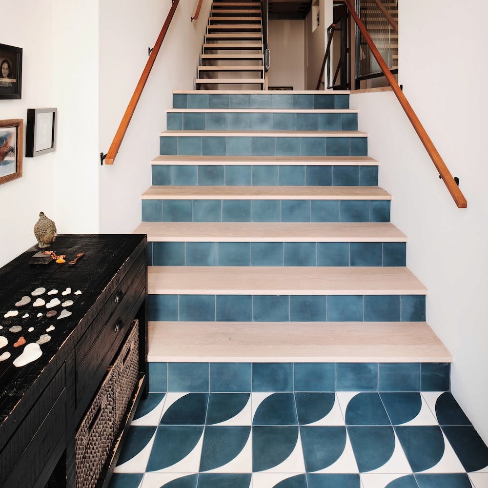
7. Mixed & Feature Layouts

Heritage & origin
Feature tiling has existed as long as tiles themselves — from Moorish interiors to Art Deco bathrooms.
The look
Layered
Personal
Expressive
What it does for a space
Creates hierarchy
Draws attention intentionally
Adds character without overwhelming
Best colours & finishes
Contrasting textures
Muted base with expressive accents
Builder’s note
Feature layouts work best when restrained. One strong moment is more effective than many competing ones.
How to Choose the Right Layout for Your Home
Before choosing a layout, consider:
Room size and ceiling height
Tile size and material
Light quality
Substrate flatness
Overall interior style
The best layouts feel inevitable, not forced.